
People on leave report
“How much of the team is away, and when?” is an awkward question to answer from a calendar. It used to mean walking Team View week by week, or counting it up by hand.
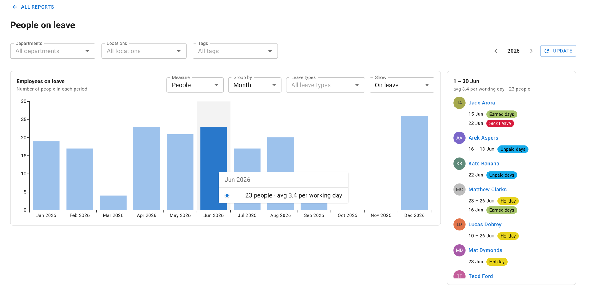
The People on leave report answers it on one screen. A chart runs across the leave year, filters narrow it to the part of the company you care about, and selecting any point on that chart shows you the people behind it, together with any leave falling in that period.
Use it to:
- find the months where cover is thinnest, before you commit to a launch or a busy season
- check whether one department or location is carrying more leave than the rest
- answer “who is off that week?” without leaving the report
- turn the question round, and see who is not taking a particular kind of leave
Where to find it
Open the Main menu → Reports and select the People on leave tile. The back link at the top left of the report returns you to this index.
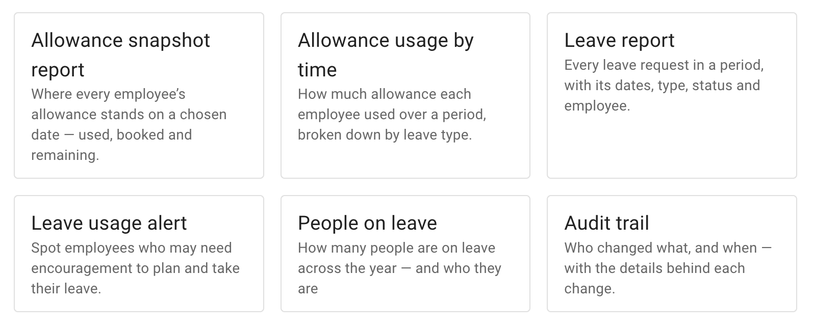
The Reports section is open to administrators and to employees who have been given access to reports — anyone who can open the section can open this report. If Reports is not in your menu, that is a permissions question for your administrator.
The leave year
The report covers one leave year at a time, and opens on the current one. The arrows either side of the year at the top of the screen step to another one.
Stepping the year re-runs the report, so it takes effect when you select Update. This is the same pattern as the other reports.
Your leave year does not have to be the calendar year. The report follows whichever one your company uses.
Reading the chart
The chart plots one value for each period across the leave year. Three things are worth knowing before you read it:
- Hovering a bar or a point shows a tooltip naming the period and giving the reading behind it.
- Selecting a bar — or a point, when the chart is drawn as a line — fills the panel beside the chart with the people behind it. The one you chose stays picked out while the rest step back.
- The title and caption above the chart restate what is currently plotted — the reading in force, the leave types the chart has been narrowed to, and the measure. Nothing is narrowed in the picture above, so they read Employees on leave and Number of people in each period; narrow the chart to particular leave types and the title says so, as in the example further down. Change a control and they change with it, so if you are ever unsure what you are looking at, read those two lines rather than working it back from the controls.
If there is nothing to chart for the year you are looking at, the report says so rather than drawing an empty axis.
Grouping
Group by sets how finely the leave year is cut — Day, Week or Month.
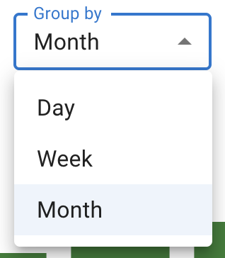
Week and Month draw bars. Day draws a line instead, because a year of individual days is far too dense to read as bars.
Which one to reach for:
- Month for the shape of the year — where the peaks sit and where the quiet stretches are.
- Week for planning cover, since a week is the unit most cover decisions get made in.
- Day for pinning down a particular stretch.
Choosing a measure
Measure decides what the height of a bar means. There are four, and they answer genuinely different questions — which is why the report offers all four rather than picking one for you.
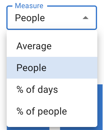
- Average — the typical number of people away on a working day in that period.
- People — how many different people were away at some point in the period, counted once each however long they were away.
- % of days — how much of the period’s available working time was lost to leave. It is time-weighted, so somebody away briefly moves it a little.
- % of people — what share of the people in that period had any leave at all. It is all-or-nothing, so somebody away briefly counts the same as somebody away throughout.
The two percentages are not two ways of saying the same thing. One is a question about time, the other a question about headcount, so they will usually show different numbers for the same period. That is expected, and neither figure is wrong — they are answers to different questions. If the two disagree on your own screen, nothing is broken.
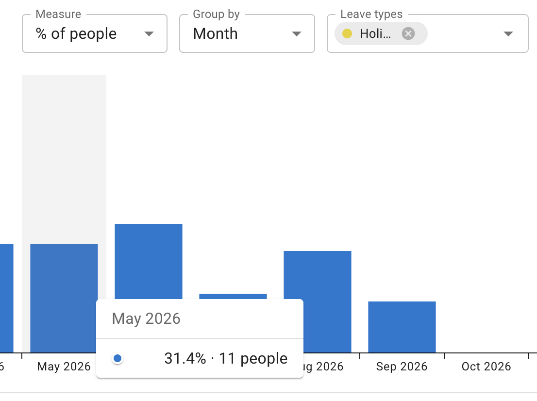
Hovering a bar helps here, because the tooltip gives more than the bare figure. In the picture below it names the period and then puts the percentage next to the number of people behind it — the quickest way to see what a share actually amounts to on your own account.
Narrowing it down
There are two kinds of filter on this screen, and they do different jobs.
Leave types, in the control row above the chart, narrows which leave counts. Choose one or more and each appears as a removable chip in the field, in its own leave type’s colour. Left empty it reads All leave types, and the report covers every one of them.
Departments, Locations and Tags, across the top of the screen, narrow who the report is about — the chart and the panel alike. Each reads All departments, All locations or All tags until you narrow it. Read the ones on your own screen; you may not see all three.
These three re-run the report, so they take effect when you select Update, the same as the year stepper beside them.
Read more: Leave types, Managing departments, Managing locations and Tagging employees
Looking at people who are without a leave type
Show switches the chart between two readings:
- On leave — the people who have the selected leave types.
- Without these types — the people who do not.
The second reading is a literal opposite, and that is the part worth pausing on. With no leave types selected it means people with no leave at all in the period you have selected — which is not quite the same thing as “people who were at work”.
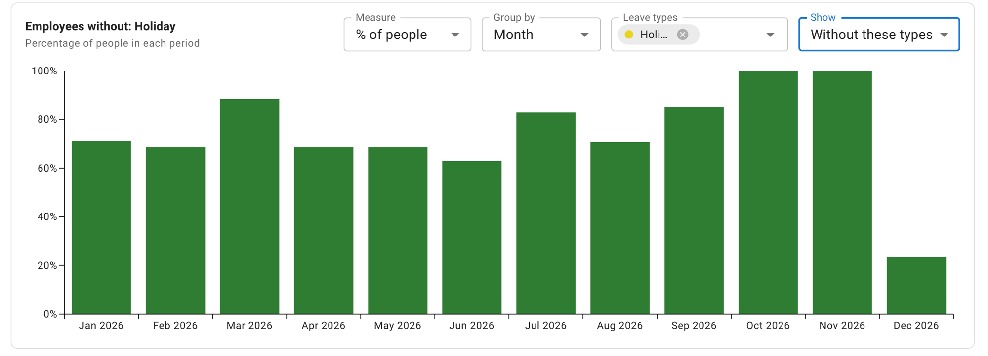
The chart title states the exact reading in force, so read the title rather than reasoning it out. In the picture below it reads Employees without: Holiday; the same chart on the other reading says Employees on leave. The caption underneath follows the measure, and the bars change colour with the reading as well.
Drilling into a period
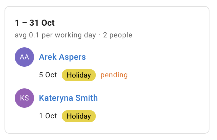
The panel beside the chart stays empty until you select a bar or a point. Once you do, it holds:
- the period you selected, as its heading
- a short summary line restating the reading for that period
- the people behind it — each person’s avatar and name, and under it any leave they have in that period, each entry giving its dates and its leave type
Selecting a person opens their employee details. Selecting an entry beneath them opens that leave. Leave that is still waiting for a decision is marked pending beside its leave type.
Good questions to point it at
Every control on this screen keeps whatever you last set it to, so a question you come to second inherits the settings from the one before. Unless a recipe says otherwise, start it from a cleared screen: Show on On leave, Leave types empty, Departments, Locations and Tags back to All, then Update. Each recipe below names only what it changes from there.
Where is cover thinnest? Set Measure to Average or % of days. Both are about working time, so they track cover; People counts anybody who was away at some point in the month, which is a different question and will point at different months. Then group by month, read the shape of the year, and select the tallest bars to see who is behind them. This is the check to run before committing to a launch date or a busy season.
Is one part of the company carrying more leave than the rest? Compare with one of the percentage measures. People and Average are counts, so the size of a department feeds into them and a bigger one will usually read higher whether or not its people are taking more leave. A percentage puts departments of different sizes on the same footing. Set a department or a location and select Update, note the shape, then switch to another, select Update again, and compare.
Who is off that week? Group by week, select the week, and read the panel. No need to go back to the calendar.
Who has no leave in a given period? Switch Show to Without these types, leave Leave types empty, and select the period you are asking about. Leave still waiting for approval counts here, so somebody with a pending request will not appear in the answer. Each bar stands on its own period, so this answers the question a day, a week or a month at a time rather than across the whole year.
Good to know
Leave requests waiting for approval are included. The chart counts them, and the panel marks them as pending. If a figure looks higher than the leave you have actually approved, this is usually why.
The two percentages disagree by design. One is about time, one is about headcount, so the same period reads differently under each.
The “without” reading is a literal opposite, not “people at work”. With no leave types selected it is people with no leave at all — in the period you have selected, not across the whole year.
Non-working days are not plotted. The chart is about working days, so weekends and the days your company is closed do not turn up as empty periods dragging the line down.
Some leave may appear under a generic name. Depending on what you are allowed to see, a leave can show simply as Leave rather than under its own leave type.
Nothing here changes anybody’s leave. The report is for reading. Approving, booking and editing all happen on the screens they always did.