
Dashboard
The Dashboard is an overview of leave for the people who look after it: an administrator sees the whole company, and a manager sees their team. On one screen it answers the questions you would otherwise piece together from several reports and the calendar: who is off today, where cover is thin this week, who is coming back, which leave types are being used, and who has gone a long time without a break.
It is a screen for reading and noticing rather than for working. Nothing is approved, booked or edited here — each card shows you the situation and hands off to the screen where the work happens.
Where to find it
The Dashboard is the first item in the Main menu, so it is one click away from anywhere. Administrators arrive on it after signing in; managers arrive on My Calendar, as everyone else does.
The Dashboard is built for a desktop-sized screen. On a phone the app takes you to the mobile calendar instead.
Who has a Dashboard
- Administrators see the whole company.
- Managers see their team: themselves and the employees whose leave they manage. The cards are the same as an administrator’s and, apart from two exceptions described below, counted over the team. The headcount card, for example, reads Active team members.
- Owners of an employee management role with View employee information see the employees that role covers, the same way.
- Employees who neither manage anybody’s leave nor own such a role have no Dashboard, and it does not appear in their menu.
Where the company’s Team view visibility settings in General settings are set to Admins only, the Dashboard is for administrators only as well.
How the screen is laid out
Cards sit on a grid, in three bands:
- A row of summary cards along the top — the at-a-glance numbers.
- A wide band underneath — the team coverage heat map beside the Coming up card.
- A row of charts and alerts at the bottom — people off, leave types by month, leave types trend, and the usage alert.
Two things are worth knowing before you start:
- There is no global filter. Cards that can be steered carry their own control — a day stepper, a year stepper, a this-week/next-week switch, a weeks/months toggle. Changing one card does not change the others.
- The layout is fixed. Cards cannot be rearranged, resized, hidden or added.
Where a card has a small info (ⓘ) button beside its title, it explains in a tooltip what that card counts.
The summary cards

Four cards run across the top of the screen.
Active employees — your current headcount, with a note of how it has changed since last month. Its ⓘ confirms that deactivated employees are left out. This is the number most of the other percentages on the screen are measured against. A manager’s card is titled Active team members and counts their team, themselves included.
Off today — how many people are off today, and what share of the company that is. A manager sees the share of their team.
Upcoming this week — what falls in this week besides ordinary leave, broken out as public holidays, company events and blackout dates. A quick check for whether there is anything unusual about the week. A manager sees the same card as an administrator: it covers the whole company’s week.
Pending leave requests — for an administrator, how many leave requests are awaiting approval across the company. For a manager, how many are waiting for them, which is the same number the Leave requests button in the top bar carries. The arrow beside the card’s title opens those requests. The number most people want to see at zero.
Read more: Public holidays and Blackouts and company events
Checking cover for the week
Two cards answer the same weekly planning question from different angles. The heat map tells you how thin cover is; the Coming up card tells you who is behind those numbers.
Team coverage heat map
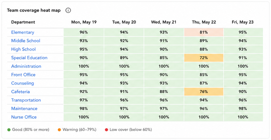
A grid of departments down the side and this week’s working days across the top. Each cell shows what share of that department is present — that is, not on leave — on that day. A manager’s grid lists only the departments their team members belong to, and each cell counts those team members rather than the whole department.
This card is not the same thing as the Heat Map screen in the main menu. The Heat Map shows absence across a whole year; this card is about cover in the week ahead, department by department.
- Cells are colour-banded from healthy cover down to thin cover, and the legend below the grid gives the bands. The percentage is always printed in the cell, so the grid reads fine without relying on colour.
- Hovering a cell shows how many people that is out of the department’s total. For a manager, it is out of their team members in that department.
- For an administrator, department names are links into that department’s settings. A manager sees them as plain names.
- The grid covers working days, Monday to Friday. Weekends are not shown.
- A department with nobody in it shows a dash rather than a percentage.
- Day headings appear in your own language and date format.
What you are scanning for is a department-and-day cell that has dropped into the lowest band, early enough to do something about it before the week starts.
Read more: Managing departments
Coming up
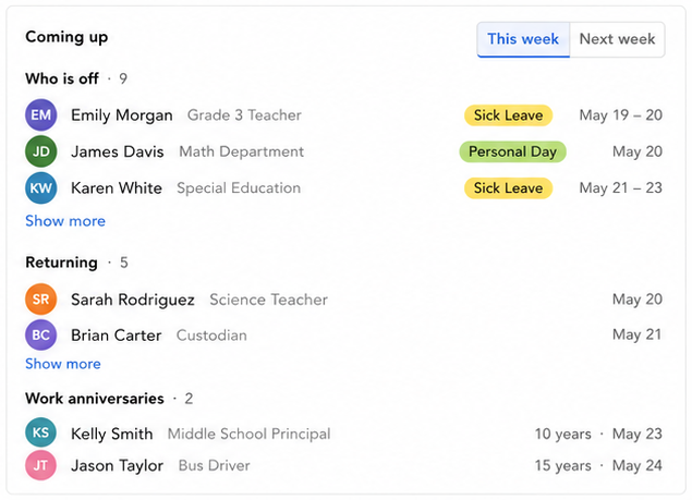
A card with a This week / Next week switch in its header, so you can look at the week in progress or plan ahead. It holds three sections:
- Who is off — each person with their department, the leave type, and the dates.
- Returning — people whose first day back falls in the week you are looking at, with that date. Useful for working out who you need to catch up with.
- Work anniversaries — people whose start-date anniversary falls in the week, with the number of years and the date. It counts from the first anniversary onwards.
Each section header carries its own count, so a busy first section never hides the fact that the others have entries.
The card shows a short preview of each section, with Show more and Show less to open it up and close it again. The preview space is shared out between the three sections, so a short or empty section gives its room to the others and you can always see something from all three without scrolling.
Selecting a person opens their employee details panel. Empty sections say so plainly, and somebody can legitimately appear under both Who is off and Returning in the same week.
Seeing who is off
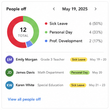
The summary card tells you how many people are off. The People off card tells you who they are, for any day you choose.
- A ring chart breaks the people off that day down by leave type, with the total in the centre and a legend giving each type’s name, its count and its share. Less-used types are folded into a grey Other so the chart stays readable.
- The header carries a date control — a back arrow, the date, a forward arrow, and a Today link that appears once you have stepped away. It opens on today.
- Underneath is a roster of the people themselves: name, department, leave type and dates, ordered to match the legend. It shows a couple of people, with Show more for the rest.
- Selecting a person opens their employee details panel.
- When nobody is off, the card says so.
Stepping back a day or two is the quickest way to answer “who was off when this happened”, and stepping forward shows you how a particular day next week is shaping up.
Spotting patterns
Two charts sit at the bottom of the screen. The first shows the shape of a leave year; the second shows the direction of travel.
Leave types taken by month
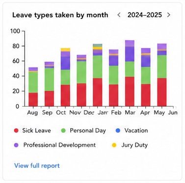
A stacked bar per month showing how much leave was taken, split by leave type, across a whole leave year.
- Months run in your company’s leave-year order. If your leave year does not start in January, neither does this chart.
- A year stepper with a This year reset moves between leave years.
- The most-used types keep their own colours and the rest fold into a grey Other. A compact legend sits under the chart, and hovering a bar segment tells you how many days it represents.
- When there is nothing to show, it says No leave taken.
Treat this chart as an indicative trend rather than an exact leave-day count. Use it to see shape and seasonality — where your peaks fall, whether sick leave clusters in one part of the year, whether everybody books their holiday in the same month. When you need exact figures, use Reports.
Leave types trend
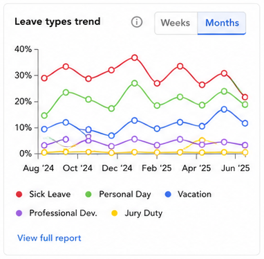
A line chart showing, for each leave type you pick, what share of the team took that type in each period.
- A Weeks / Months toggle switches between a short recent window and a longer one.
- You choose which leave types to plot. Each one you select shows as a coloured, removable chip below the chart, and the chips double as the legend. An Add leave type menu offers the ones you have not picked, and stops offering more once you reach the limit.
- Any leave type can be plotted, including one nobody is currently using — useful for watching whether something starts to appear.
- Your choices are remembered between visits: the same leave types and the same weeks or months view next time you open the Dashboard.
- Only leave already taken counts. Leave booked for the future does not lift the line until the days arrive.
- The ⓘ beside the toggle confirms that the percentages are a share of the currently active employees. For a manager, that is the active employees in their team.
- Where Reports is in your main menu, the Open the people-on-leave report link at the foot of the card takes you to the People on leave report — a wider view of absence across a whole leave year, where you can open up any period and see who is behind the figures. Expect the two to disagree: this card counts only leave already taken, while that report covers the whole leave year, future leave and requests awaiting approval included.
Read more: Leave types
Following up on people who aren’t taking leave
The Usage alert card summarises employees who have gone a long stretch without taking any leave: a headline count against the size of the company, a split into severity tiers each with its own ⓘ, and the longest current gap in the company. For a manager, all three cover their team.
Where Reports is in your main menu, it links straight through to the full Leave usage alert report, where you can see the detail behind those counts and send a reminder to the employees who need one.
Read more: Leave usage alert
Good to know
Only approved leave counts as being off. Everywhere on the Dashboard, somebody counts as off once their leave is approved. Leave requests still waiting for approval do not — they show in the Pending leave requests card instead. This is the most common reason for the numbers not adding up the way you expect.
The coverage heat map and the Coming up card cover working days, Monday to Friday.
An administrator sees the company; a manager sees their team. For an administrator, the cards cover the whole company rather than one department or team. For a manager, every card that counts or lists people covers their team: themselves and the employees whose leave they manage. There are two exceptions. Upcoming this week covers the whole company’s week for everyone, and a manager’s Pending leave requests counts the requests waiting for them. The coverage heat map is the one that breaks its results down by department.
The figures are current. There is no refresh button and none is needed. Coming back to the Dashboard shows up-to-date numbers, including after leave has been approved somewhere else.
Each card is independent. Steppers and toggles change only their own card, and nothing on the Dashboard changes anybody’s leave.
Selecting a person opens their details. On the Coming up card and the People off roster, a person’s name or avatar opens their employee details panel from the side, without leaving the Dashboard.
The month chart is an indicative trend, not an exact count. Use Reports when the figures need to be exact.